Introduction
About this document.
This is a living document, as the Ebola epidemic is rapidly evolving. Presented below is a preliminary modeling approach to the crisis, originally conceived as an illustration of the spatial SEIR model family generally and the capabilities of the rapidly developing (and totally unfinished) libspatialSEIR software library particularly. This is not yet peer reviewed research, or even a particularly complete analysis. Nevertheless, we hope that the initial exploration given below is instructive and useful
All revisions of and changes to this document are saved on the gh-pages branch of the libspatialSEIR git repository. Several past versions are also cached in an external repository:
- Aug 12, 2014
- Aug 10, 2014
- Aug 5, 2014
- Aug 3, 2014
- Jul 30, 2014
- Jul 29, 2014
- Jul 25, 2014
- Jul 25, 2014
Additional analyses are underway. An informal look at prediction performance over time is now available.
Summary of Recent Changes
- July 30 Previous predictions of mid-fall resolution of epidemic begin to shift.
- Aug 3 Predicted epidmic curves start to strongly favor a uniformly worsening situation.
- Aug 5 Models begin to show catastrophic predictions. Epidemic is changing too quickly for these simple models.
- Shorten prediction window
- Increase intensity process flexibility (quartic rather than cubic)
- Recall that these models can't account for changing inteventions, of which there are many. The predictions are therefore made under the assumption that the epidemic will continue to evolve according to the same process it has so far.
- Aug 10 Predictions remain much the same, though perhaps not so immediately catestrophic as the August 5 predictions.
- Aug 12 Liberia continues to worsen, though Sierra Leone appears to have leveled off. Guinea might be worsening slightly.
- Aug 28 With the addition of Nigeria and new data, the situation appears dire across the board, especially in Liberia. The basic reproductive number calculations no longer look reasonable, so more must be done to estimate them separately for each country. The changes may also be due to recent changes to the R0 estimation code, which must now be reevaluated. This work is underway.
The Outbreak
The 2014 Ebola outbreak in West Africa is an ongoing public health crisis, which has killed hundreds of people so far. The cross-border nature of this epidemic, which has emerged in Guinea, Liberia and Sierra Leone has complicated mitigation efforts, as has the poor health infrastructure in the region. While there has been much analysis and speculation about the factors at play in the spread of the virus, to our knowledge there aren't any specific predictions about the expected duration and severity of this particular epidemic. In the (certainly temporary) absence of epidemic forecasts, this document explores a simple spatial SEIR model to make some initial predictions.
The Data
A summary of the WHO case reports is very helpfully compiled on wikipedia. It can be easily read into R with the xml library:
With data in hand, let's begin where every analysis should begin: graphs.
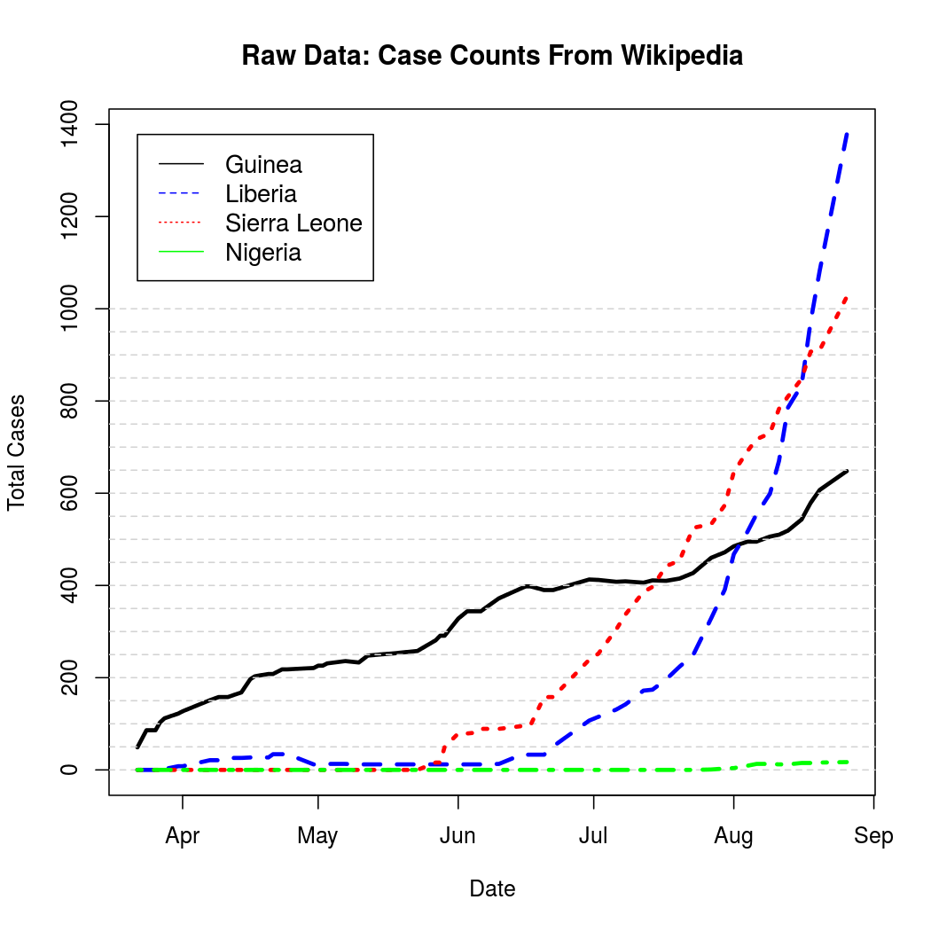
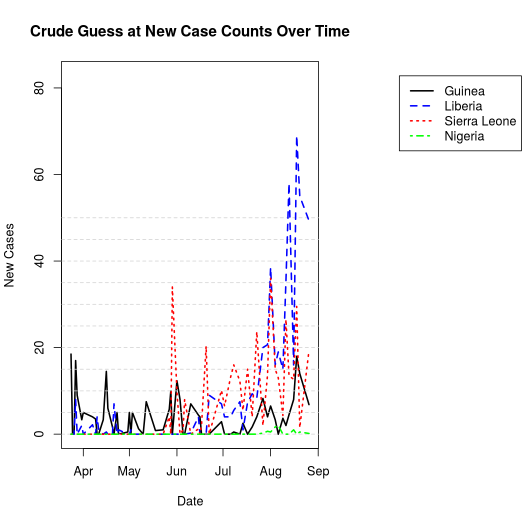
These represent cumulative counts, but because case reports can be revised downward due to non-Ebola illnesses the graphs are not monotone. A quick, but effective solution to this problem is to simply "un-cumulate"* the data and bound it at zero to get a rough estimate of new case counts over time.
*Unlike uncumulate, decumulate is actually a word. Unfortunately it just means "to decrease", and so was unsuitable for use here. There should probably be a word for uncumulating things, perhaps uncumulate.
For better graphical representation, the "un-cumulated" counts are scaled to represent average number of infections per day, and linearly interpolated. The process is a bit noisier from this perspective when compared to the original cumulative counts.
One can also represent this data geographically to get an idea of the spatial epidemic pattern, and to place the problem in a more relatable context.
Average Number of Infections Per Day:
Compartmental Models
Now that the data is read in (and now that we have several plots to suggest that we haven't done anything too terribly stupid with it) , let's do some compartmental epidemic modeling. Not only has Ebola been well modeled in the past using compartmental modeling techniques, but this author happens to be working on a software library designed to fit compartmental models in the spatial SEIRS family. What a strange coincidence! Specifically, we'll be using heirarchical Bayesian estimation methods to fit a spatial SEIR model to the data.
While a full treatment of this field of epidemic modeling is (far) beyond the scope of this writing, the basic idea is pretty intuitive. In order to come up with a simplified model of a disease process, discrete disease states (aka, compartments) are defined. The most common of these are S, E, I, and R which stand for:
- Susceptible to a particular disease
- Exposed and infected, but not yet infectious
- Infectious and capable of transmitting the disease
- Removed or recovered
This sequence, traversed by members of a population (S to E to I to R), forms what we might call the temporal process model of our analysis. This analysis belongs to the stochastic branch of the compartmental modeling family, which has its roots in deterministic systems of ordinary and partial differential equations. In the stochastic framework, transitions between the compartments occur according to unknown probabilities. It is the S to E probability, which captures infection activity, into which we introduce spatial structure. Some details of this are given as comments to the code below, and more information than you probably want on the statistical particulars is available in this pdf document. For now, suffice it to say that we'll place a simple spatial structure on the epidemic process which simply allows disease to spread between the three nations involved, and we'll try to estimate the strength of that relationship. Many other potential structures are possible, limited primarily by the amount of additional research and data compilation one is willing to do.
For the purposes of this analysis, we will not do anything fancy with demographic information or public health intervention dates. Demographic parameters are relatively difficult to estimate here, as there are only three spatial units which are all from the same region. Intervention dates are more promising, but their inclusion requires much more background research than we have time for here. In the interest of simplicity and estimability, we'll just fit a different disease intensity parameter for each of the three countries to capture aggregate differences in Ebola susceptibility in addition to using a set of basis functions to capture the temporal trend.
Analysis 1
Set Up
There are some things we need to define before we can start fitting models and making predictions.
- The population sizes need to be determined.
- Initial values for the four compartments must be determined.
- The time points are not evenly spaced, so we need to define appropriate offset values to capture the amount of aggregation performed (time between reports).
- We must define the spatial correlation structure.
- A set of basis functions needs to be chosen to capture the temporal trend.
- Prior parameters and parameter staring values must be specified for each chain.
- A whole bunch of bookkeeping stuff for which I haven't yet programmed sensible default behavior needs to be set up.
Compartment starting values follow the usual convention of letting the entire initial population be divided into susceptibles and infectious individuals. The starting value for the number of infectious individuals was 86, the first infection count available in the data. Offsets are actually calculated in the first code block (above) as the differences between the report times. For temporal basis functions, orthogonal polynomials of degree three were used. Prior parameters for the E to I and I to R transitions were chosen based on well documented values for the average latent and infectious times, and the rest of the prior parameters were left vague. These decisions are addressed in more detail as comments to the code below.
With the set up out of the way, we can finally build and run the models the models. The code presented below has recently (8/27/2014) been set up to use the "parallel" library which is included with the R statistical analysis software. While this allows us to spend considerably less time waiting for the document to compile, the code may be more difficult to understand for those unfamiliar with this useful parallelization library. The previous analyses, linked above, may be a better guide to the basic use of the spatialSEIR library for such users.
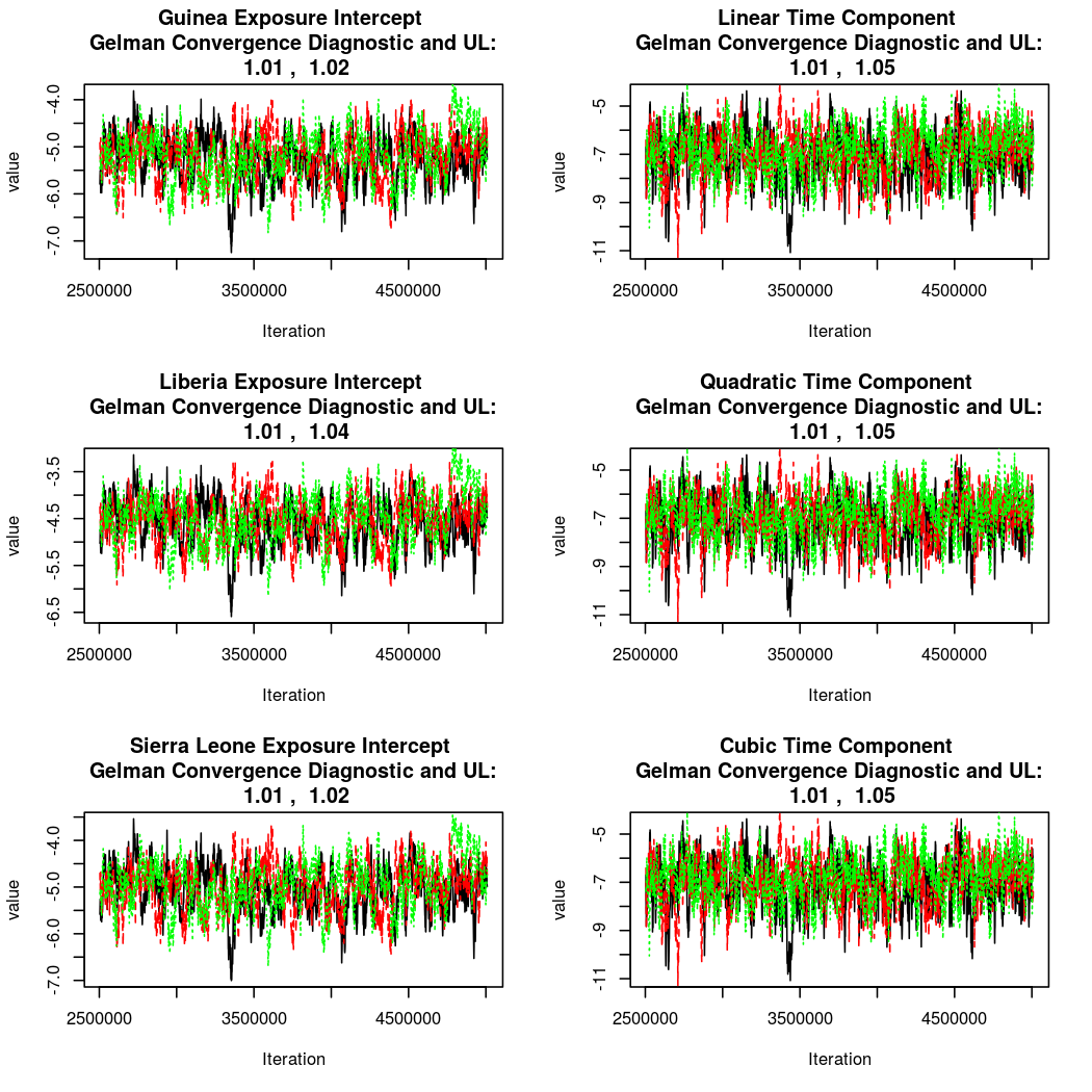
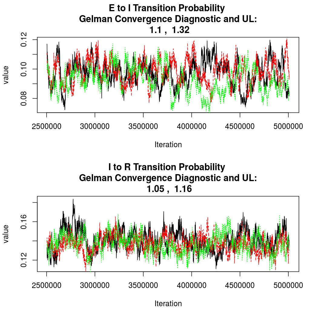
As this is a Bayesian analysis in which the posterior distribution is sampled using MCMC techniques, we really need some indication that the samplers have indeed converged to the posterior distribution in order to make any inferences about the problem at hand. In the code below, we'll read in the MCMC output files created so far, plot the three chains for each of several important parameters, and take a look at the Gelman and Rubin convergence diagnostic (which should be close to 1 if the chains have converged.)
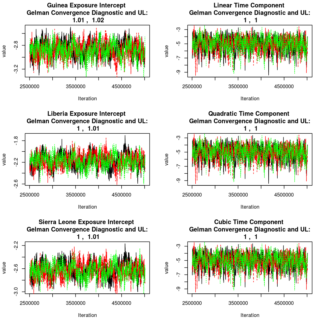
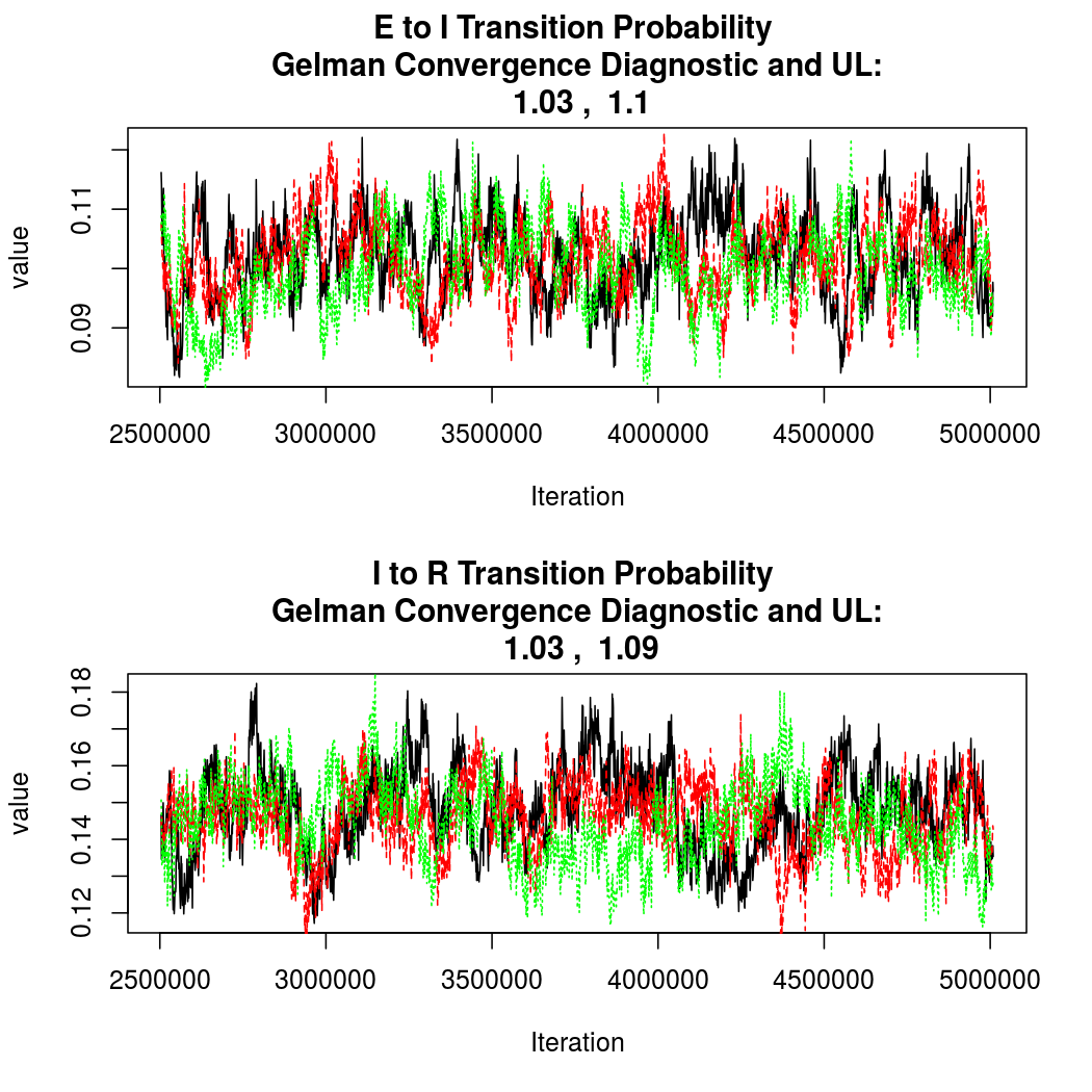
The convergence looks quite reasonable, so let's dissect the estimates a bit.
Estimated Epidemic Behavior
## Output from coda library summary:
## ########################
##
## Iterations = 1:2506
## Thinning interval = 1
## Number of chains = 3
## Sample size per chain = 2506
##
## 1. Empirical mean and standard deviation for each variable,
##    plus standard error of the mean:
##
##                                  Mean      SD Naive SE Time-series SE
## Guinea Intercept             -2.87701 0.12709 1.47e-03       6.42e-03
## Liberia Intercept            -2.17583 0.12357 1.43e-03       6.83e-03
## Sierra Leone Intercept       -2.62953 0.12726 1.47e-03       6.88e-03
## Nigeria Intercept            -5.09220 1.01967 1.18e-02       3.55e-02
## Linear Time Component         9.51054 1.01445 1.17e-02       4.97e-02
## Quadratic Time Component     -8.64291 0.91460 1.05e-02       4.75e-02
## Cubic Time Component          5.59542 0.72574 8.37e-03       3.76e-02
## Quartic Time Component       -1.47478 0.37068 4.28e-03       2.52e-02
## Spatial Dependence Parameter  0.00889 0.00185 2.13e-05       8.43e-05
## E to I probability            0.10115 0.00687 7.93e-05       5.26e-04
## I to R probability            0.14611 0.01077 1.24e-04       9.73e-04
##
## 2. Quantiles for each variable:
##
##                                   2.5%      25%      50%     75%   97.5%
## Guinea Intercept              -3.13376 -2.96223 -2.87405 -2.7877 -2.6364
## Liberia Intercept             -2.41897 -2.26074 -2.17307 -2.0897 -1.9427
## Sierra Leone Intercept        -2.88032 -2.71388 -2.62841 -2.5415 -2.3877
## Nigeria Intercept             -7.32978 -5.72044 -4.99347 -4.3649 -3.4024
## Linear Time Component          7.62770  8.81565  9.47650 10.1894 11.5742
## Quadratic Time Component     -10.51057 -9.25984 -8.61686 -8.0074 -6.9179
## Cubic Time Component           4.19592  5.09820  5.59362  6.0784  7.0311
## Quartic Time Component        -2.22704 -1.72631 -1.46943 -1.2257 -0.7641
## Spatial Dependence Parameter   0.00539  0.00764  0.00884  0.0101  0.0127
## E to I probability             0.08738  0.09650  0.10113  0.1058  0.1144
## I to R probability             0.12498  0.13875  0.14627  0.1534  0.1670
The average time spent in a particular disease compartment is just one divided by the probability of
a transition between compartments. The units here are days, so we can see that the average infectious time is estimated to be between
78.9
and
185.6
days, while the average latent time is most likely between
-1.3
and
-0.4
(95% credible intervals). In reality, there is a lot
of variability in these times for Ebola, but these seem like reasonable estimates for the average values.
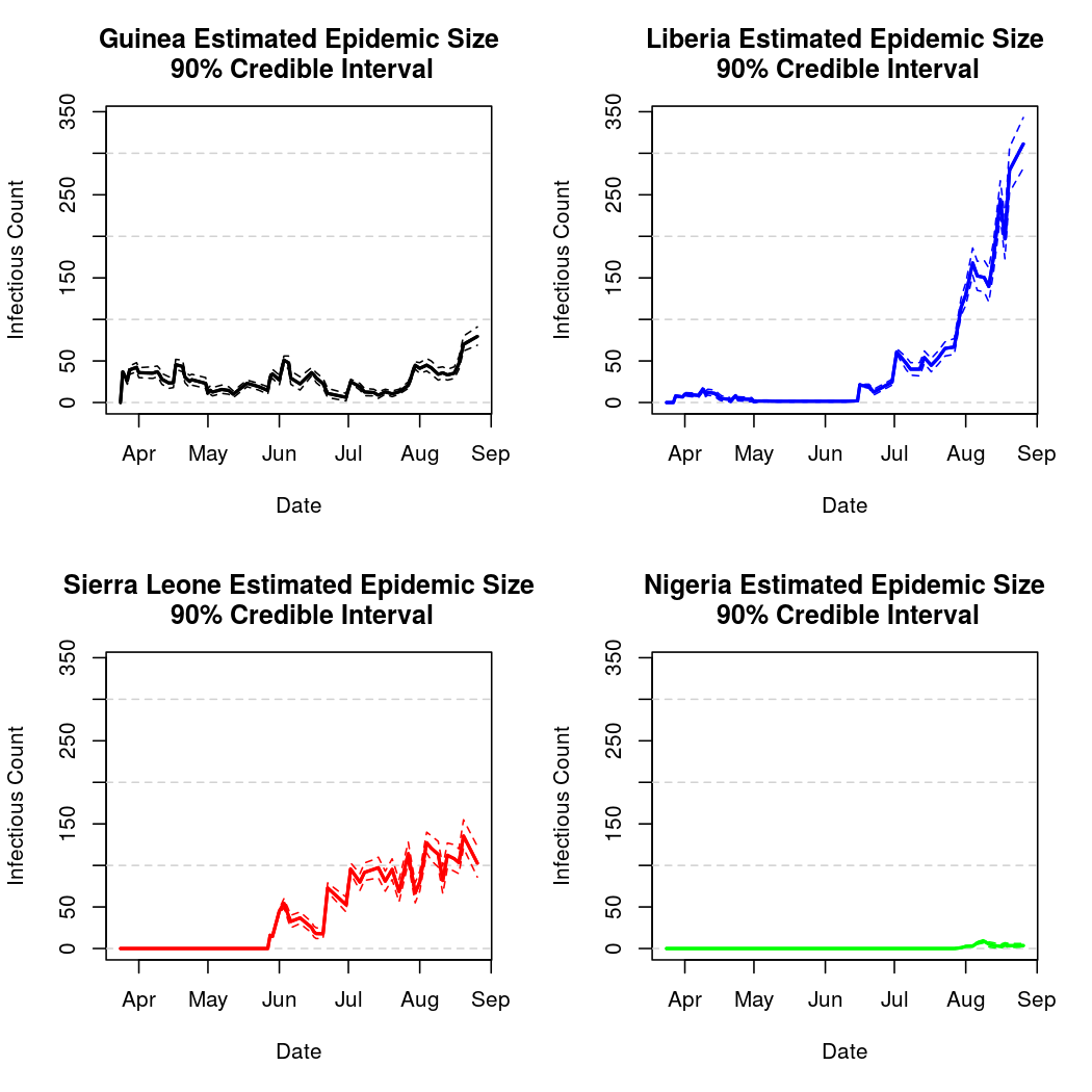
We also notice that there is definitely non-zero spatial dependence (the distribution of the spatial dependence parameter is well separated from zero), indicating significant mixing between the populations. This is unsurprising, as the disease has in fact spread between all three nations.
It also appears that Guinea has the lowest estimated epidemic intensity, followed by Sierra Leone and Liberia, which have similar credible intervals for their intercept parameters.
Basic Reproductive Number Calculation
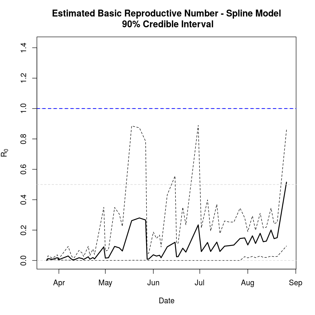
A common tool for describing the evolution of an epidemic is a quantity known as the basic reproductive numer, the basic reproductive ratio, or one of several other variants on that theme. The basic idea is to quantify how many secondary infections a single infectious individual is expected to cause in a large, fully susceptible population. Naturally, when this ratio exceeds one we expect the epidemic to spread. Conversely, a basic reproductive number less than one indicates that a pathogen is more likely to die out. This software library doesn't yet compute the ratio automatically, but does provide what's known as the "next generation matrix" which can be used to quickly calculate the quantity.
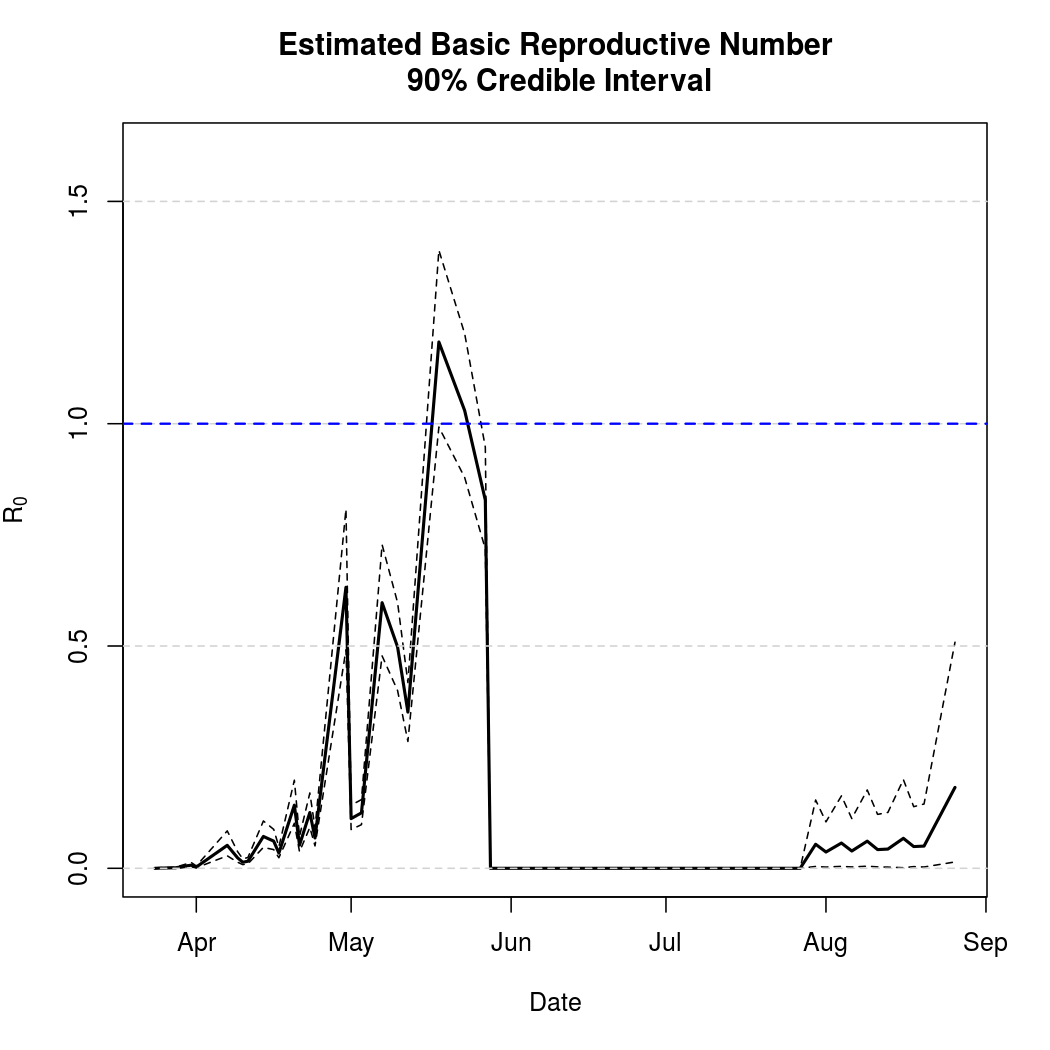
These figures no longer look reasonable with the introduction of Nigeria, so work is underway to estimate the quantity separately for each nation.
Epidemic Prediction
Currently the simulation required for epidemic prediction must be done "manually" by writing a bunch of R code. As the library develops, a simpler prediction interface is a high priority.
Below, we will attempt to predict the course of the epidemic through early fall. We must be cautious when making predictions about a chaotic process this far into the future. We must be particularly cautious because the basis chosen for the temporal trend in the epidemic intensity process was polynomial. While polynomial bases often provide a good fit to the data, they can behave unreasonably outside the range over which the model was fit (quadratic and cubic terms can get large very quickly).
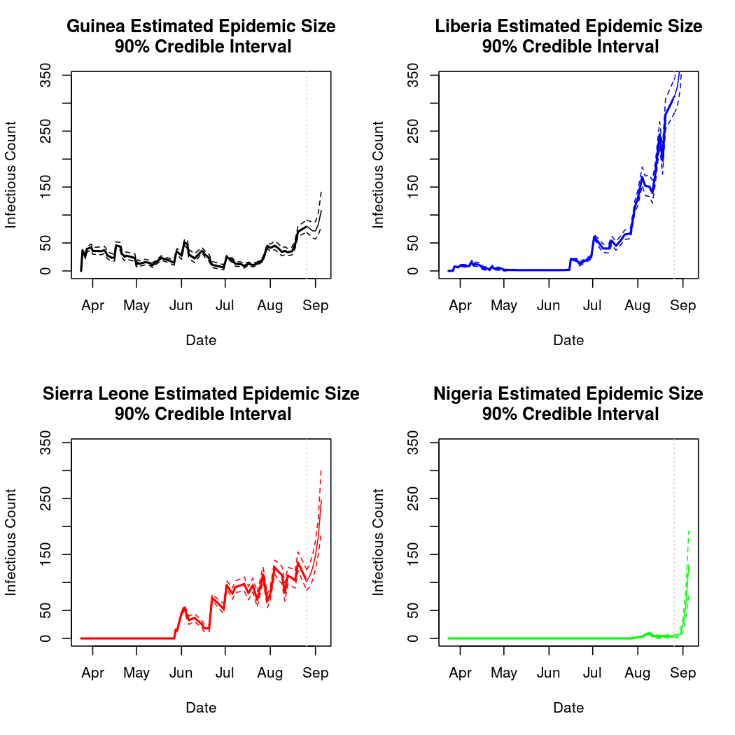
These predictions do not look alltogether unreasonable, though past analyses have shown that such polynomial bases can extrapolate poorly. Analysis 2 will consider the results of using a natural spline basis for this process instead. Spline bases extrapolate linearly, and so are less prone to extreme extrapolation errors.
Analysis 2: Spline Basis
Set Up
The problem with polynomial basis functions is that they extrapolate poorly, exhibiting extreme behavior under prediction. On the other hand, they often perform quite well for estimation purposes and prediction within the range of observed data. For this reason, and because spline basis coefficients are somewhat difficult to interpret, analysis 2 will not repeat the qualitative interpretation work presented above. Parameter estimates are available below for completeness.
Convergence
Again, convergence looks quite good:
Basic Reproductive Number Calculation
Again, the basic reproductive number estimate no longer appears reasonable.
Epidemic Prediction
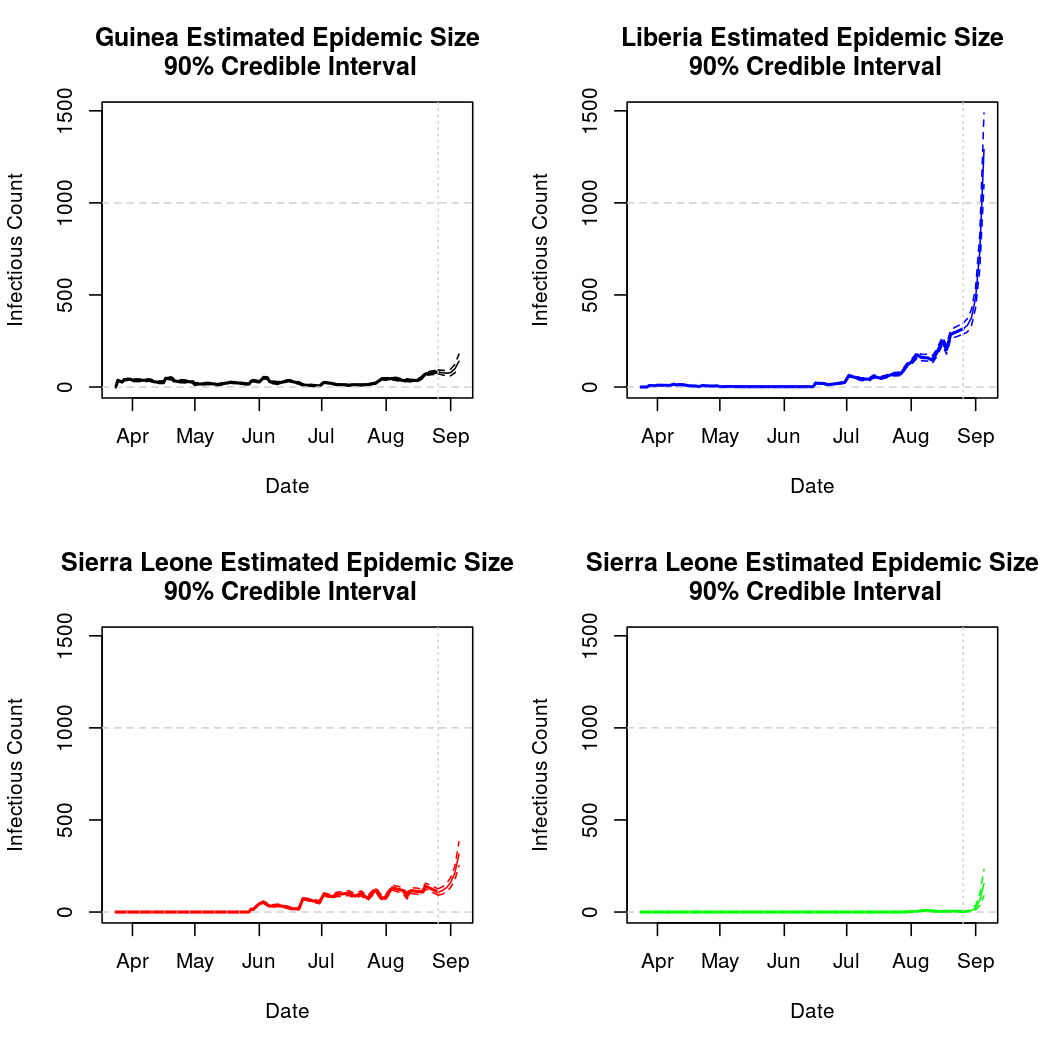
Here we see the most prominant difference between the two approaches. Namely, these predictions appear more reasonable. Such data can also be visualized in map form, though the recent surge in predicted cases has the effect of swamping the earlier dynamics:
Total Infection Size - Estimated and Predicted:
Conclusions
This epidemic is evolving extremely rapidly. As of 8/12, it looked like the situation in Liberia was set to continue worsening, and that Guinea is at risk of the same (though not to nearly the same degree). On the other hand, the epidemic in Sierra Leone appeared to be leveling off (though not disappearing). As of 8/28, these look like reasonable predictions, however the models appear to have resumed predicting a fairly catastrophic continued spread, especially in liberia. In particular, the models predict that the epidemic will take off in Nigeria, as the countries are assumed in this case to share several intensity parameters. We may hope that this particular simplifying assumption is invalid, however it is not a hopeful sign that WHO predictions are also becoming catastrophic. These models can not anticipate public health interventions and sudden changes in governmental policy and individual behavior, but recent news from the region gives little reason to hope for a swift end to the epidemic. It is more important now than ever to support the efforts of involved governmental and non-governmental organizations like the WHO and MSF
That wraps up the analyses for now. This document will continue to be updated as the epidemic progresses, reflecting new data and perhaps additional analysis techniques. As the document is tracked via source control it will be easy to see how well past predictions held up and how they change in response to new information. Questions and comments can be shared here